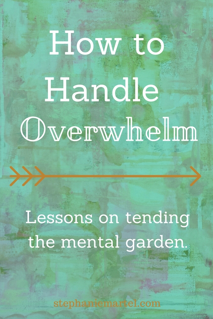
Art in Progress: Bloom
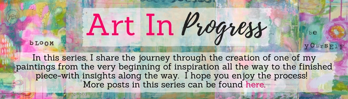
I was inspired by a color palate I had seen online and wanted to create something that felt light + hopeful. I can sometimes get carried away with intense colors and forget to leave light space in for a place for the eye to rest and chill out. (It’s a good metaphor for life, too.) I gave myself the challenge to stay light with this one and it was a fun task to remember along the way. The first layer or two was fast + easy and included some tissue paper.
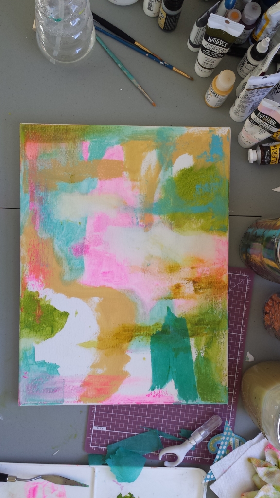
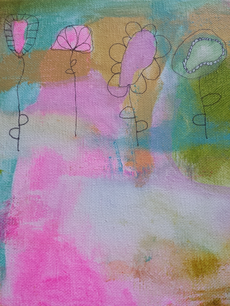
I added some objects early on, which I don’t normally do because it limits what I end up doing for the final product. I usually turn the canvas around a lot and try different viewpoints, but when I put an object in, it anchors the piece a specific way. Oh well! The colors were calling out for some flowers.
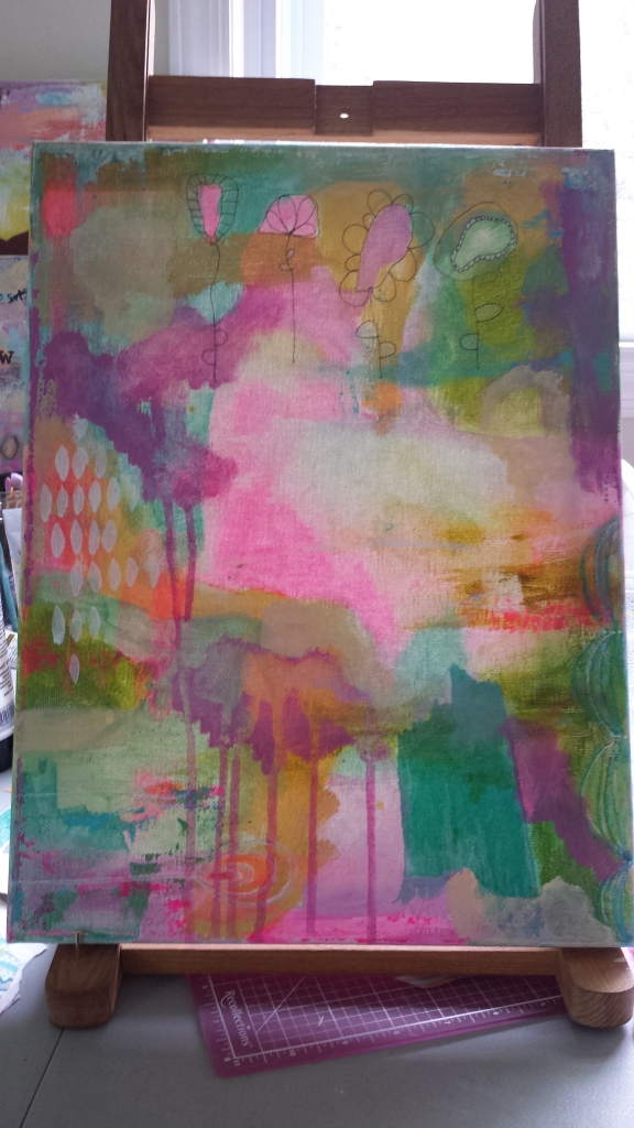
I couldn’t resist my nagging urge (ha!) to darken it up a little with that purple. So I added in a little white stencil on the side to balance it out and added more light objects in the bottom left corner. I’m starting to like it at this point because it feels light, but like my individual style, too. (I feel like I’m always finding my style and changing it up.)
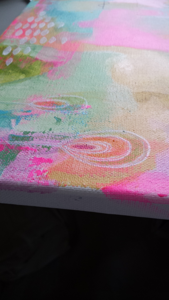
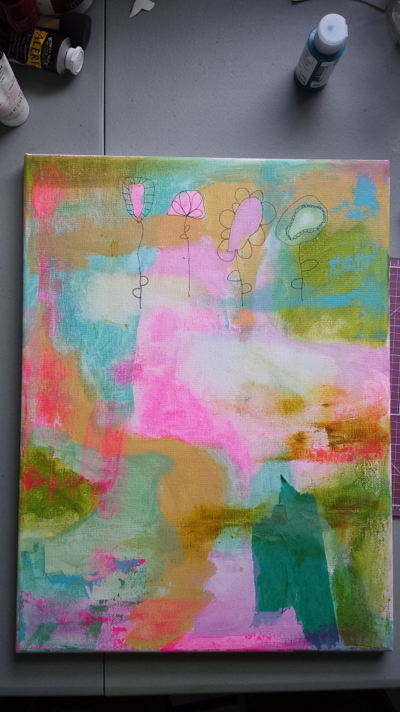
Here’s a close up of that bottom corner before the purple, I love the colors together!

And the flowers.
I added a few more small accents and I’m done. That space in the middle bothered me at first, but then I remembered my challenge was to stay light and there it was! It was a perfect place for my sentiment–we all need space to BLOOM.

Prints available in the shop!